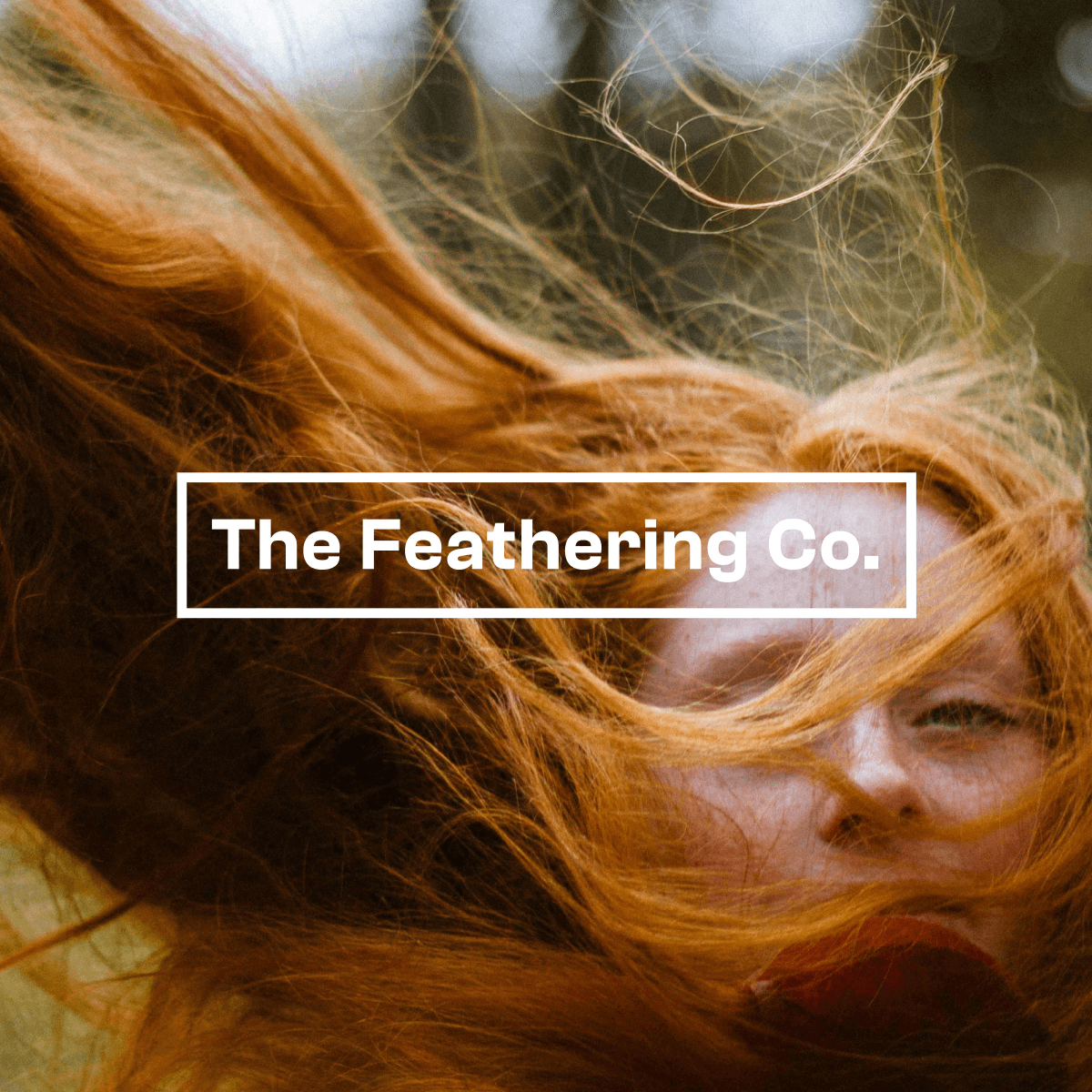
The Feathering Co
Brief
Design a simple, minimalist logo and brand identity for The Feathering Co., a video pre-production and post-production company.
Challenge
Create an identity that’s bold, versatile and instantly recognisable. It has to sit over moving image without competing with it, and also work on its own across merchandise, collateral and digital touchpoints.
Approach
I kept the logo to a clean, bold sans-serif wordmark inside a thin rectangular frame. The frame works like a viewfinder or crop mark, a subtle nod to the craft of framing a shot. Built in white, it can sit over footage and photography like a title card, keeping the work itself the hero. From there, I’m developing a restrained type system and a versatile colour palette drawn from warm, natural film tones, with neutral base colours for flexibility. The identity will be shown in use across video overlays, social assets, merchandise and stationery, so the logo, typography and colours work together as one cohesive brand.


